ดาวน์โหลดงานนำเสนอ
งานนำเสนอกำลังจะดาวน์โหลด โปรดรอ

1
Krich Sintanakul Department of Computer Education KMUTNB
Interactive Design Krich Sintanakul Department of Computer Education KMUTNB

2
What is interaction design?
Designing interactive products to support people in their everyday and working lives Sharp, Rogers and Preece (2002) The design of spaces for human communication and interaction Winograd (1997) 724401
 The design of spaces for human communication and interaction. Winograd (1997)")
3
Goals of interaction design
Develop usable products Usability means easy to learn, effective to use and provide an enjoyable experience Involve users in the design process 724401

4
Example of bad and good design
Elevator controls and labels on the bottom row all look the same, so it is easy to push a label by mistake instead of a control button People do not make same mistake for the labels and buttons on the top row. Why not? From: 724401

5
What to design Need to take into account:
Who the users are What activities are being carried out Where the interaction is taking place Need to optimise the interactions users have with a product Such that they match the users activities and needs 724401

6
Understanding users’ needs
Need to take into account what people are good and bad at Consider what might help people in the way they currently do things Listen to what people want and get them involved Use tried and tested user-based methods 724401

7
From HCI to Interaction Design
Human-computer interaction (HCI) is: “concerned with the design, evaluation and implementation of interactive computing systems for human use and with the study of major phenomena surrounding them” (ACM SIGCHI, 1992, p.6) Interaction design (ID) is: “the design of spaces for human communication and interaction” Winograd (1997) Increasingly, more application areas, more technologies and more issues to consider when designing ‘interfaces’ 724401
 is: concerned with the design, evaluation and implementation of interactive computing systems for human use and with the study of major phenomena surrounding them (ACM SIGCHI, 1992, p.6) Interaction design (ID) is: the design of spaces for human communication and interaction Winograd (1997) Increasingly, more application areas, more technologies and more issues to consider when designing ‘interfaces’")
8
Many kinds of interaction styles available…
Command Speech Data-entry Form fill-in Query Graphical Web Pen Augmented reality Gesture and even... 724401

9
Relationship between ID, HCI and other fields
Academic disciplines (e.g. computer science, psychology) Design practices (e.g. graphic design) Interaction Design Interdisciplinary fields (e.g HCI, CSCW) 724401
 Design practices. (e.g. graphic design) Interaction. Design. Interdisciplinary fields. (e.g HCI, CSCW)")
10
Relationship between ID, HCI and other fields
Academic disciplines contributing to ID: Psychology Social Sciences Computing Sciences Engineering Ergonomics Informatics 724401

11
Relationship between ID, HCI and other fields
Design practices contributing to ID: Graphic design Product design Artist-design Industrial design Film industry 724401

12
Relationship between ID, HCI and other fields
Interdisciplinary fields that ‘do’ interaction design: HCI Human Factors Cognitive Engineering Cognitive Ergonomics Computer Supported Co-operative Work Information Systems 724401

13
What is involved in the process of interaction design
Identify needs and establish requirements Develop alternative designs Build interactive prototypes that can be communicated and assessed Evaluate what is being built throughout the process 724401

14
Usability goals Effective to use Efficient to use Safe to use
Have good utility Easy to learn Easy to remember how to use 724401

15
Activity on usability How long should it take and how long does it actually take to: use a VCR to play a video? use a VCR to pre-record two programs? use an authoring tool to create a website? 724401

16
User experience goals Satisfying - rewarding Fun - support creativity
Enjoyable - emotionally fulfilling Entertaining …and more Helpful Motivating 724401

17
Usability and user experience goals
How do usability goals differ from user experience goals? Are there trade-offs between the two kinds of goals? e.g. can a product be both fun and safe? How easy is it to measure usability versus user experience goals? 724401

18
Design principles Generalizable abstractions for thinking about different aspects of design The do’s and don’ts of interaction design What to provide and what not to provide at the interface Derived from a mix of theory-based knowledge, experience and common-sense 724401

19
Visibility This is a control panel for an elevator.
• How does it work? • Push a button for the floor you want? • Nothing happens. Push any other button? Still nothing. What do you need to do? From: 724401

20
Visibility • make relevant parts visible
…you need to insert your room card in the slot by the buttons to get the elevator to work! How would you make this action more visible? • make the card reader more obvious • provide an auditory message, that says what to do (which language?) • provide a big label next to the card reader that flashes when someone enters • make relevant parts visible • make what has to be done obvious From: 724401
 • provide a big label next to the card reader that flashes when someone enters. • make relevant parts visible. • make what has to be done obvious. From:")
21
Feedback Sending information back to the user about what has been done
Includes sound, highlighting, animation and combinations of these e.g. when screen button clicked on provides sound or red highlight feedback: “ccclichhk” 724401

22
Constraints Restricting the possible actions that can be performed
Helps prevent user from selecting incorrect options Three main types (Norman, 1999) physical cultural logical 724401
 physical. cultural. logical")
23
Physical constraints Refer to the way physical objects restrict the movement of things E.g. only one way you can insert a key into a lock How many ways can you insert a CD or DVD disk into a computer? How physically constraining is this action? How does it differ from the insertion of a floppy disk into a computer? 724401

24
Logical constraints Exploits people’s everyday common sense reasoning about the way the world works An example is they logical relationship between physical layout of a device and the way it works as the next slide illustrates 724401

25
Logical or ambiguous design?
Where do you plug the mouse? Where do you plug the keyboard? top or bottom connector? Do the color coded icons help? From: 724401

26
How to design them more logically
(i) A provides direct adjacent mapping between icon and connector (ii) B provides color coding to associate the connectors with the labels From: 724401
 A provides direct adjacent mapping between icon and connector. (ii) B provides color coding to associate the connectors with the labels. From:")
27
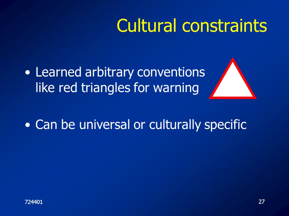
Cultural constraints Learned arbitrary conventions like red triangles for warning Can be universal or culturally specific 724401
28
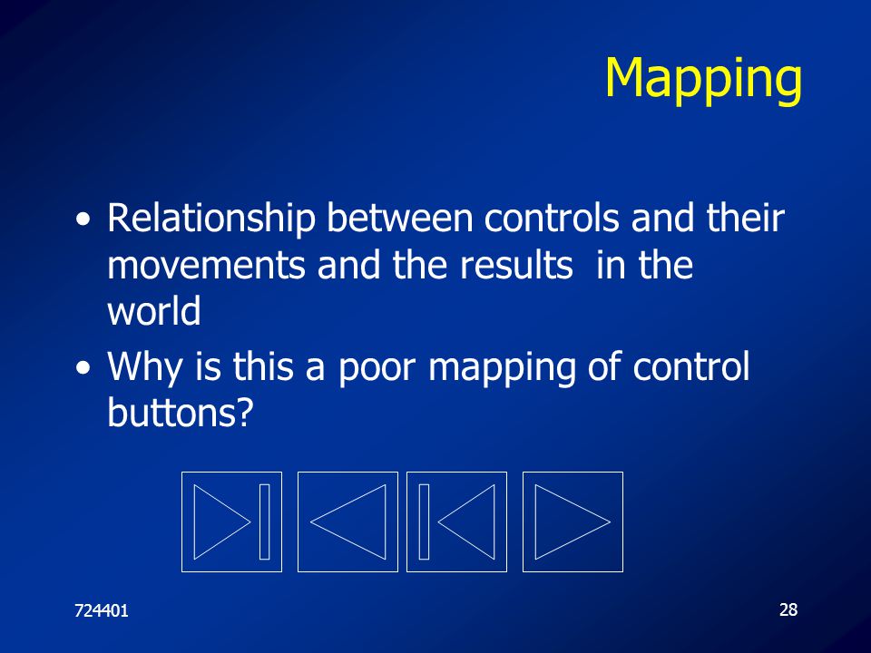
Mapping Relationship between controls and their movements and the results in the world Why is this a poor mapping of control buttons? 724401
29
Activity on mappings Why is this a better mapping?
The control buttons are mapped better onto the sequence of actions of fast rewind, rewind, play and fast forward 724401

30
Activity on mappings Which controls go with which rings (burners)? A B
D 724401

31
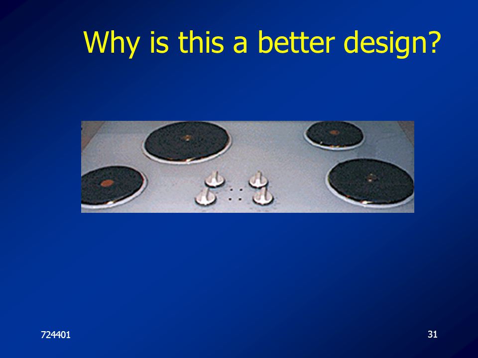
Why is this a better design?
724401
32
Consistency Design interfaces to have similar operations and use similar elements for similar tasks For example: always use ctrl key plus first initial of the command for an operation – ctrl+C, ctrl+S, ctrl+O Main benefit is consistent interfaces are easier to learn and use 724401

33
When consistency breaks down
What happens if there is more than one command starting with the same letter? e.g. save, spelling, select, style Have to find other initials or combinations of keys, thereby breaking the consistency rule E.g. ctrl+S, ctrl+Sp, ctrl+shift+L Increases learning burden on user, making them more prone to errors 724401

34
Internal and external consistency
Internal consistency refers to designing operations to behave the same within an application Difficult to achieve with complex interfaces External consistency refers to designing operations, interfaces, etc., to be the same across applications and devices Very rarely the case, based on different designer’s preference 724401

35
Keypad numbers layout A case of external inconsistency 1 2 3 4 5 6 7 8
9 (a) phones, remote controls (b) calculators, computer keypads 724401
 phones, remote controls. (b) calculators, computer keypads")
36
บรรทัดฐานในการออกแบบ
ตอบสนองประโยชน์ใช้สอย ความสวยงามพึงพอใจ (Aesthetic) การสื่อความหมาย (Memory Unit) 724401
 การสื่อความหมาย (Memory Unit)")
37
Graphic Design Workflow
วิเคราะห์โจทย์ (Program Analysis) What Where Who How สร้างแนวความคิดในการออกแบบ (Conceptual Design) ต้องคำนึงถึง Design Criteria ศึกษางานหรือกรณีตัวอย่างที่มีอยู่ (Case Study) ออกแบบร่าง (Perliminary Design) ออกแบบจริง (Design) 724401
 What Where Who How. สร้างแนวความคิดในการออกแบบ (Conceptual Design) ต้องคำนึงถึง Design Criteria. ศึกษางานหรือกรณีตัวอย่างที่มีอยู่ (Case Study) ออกแบบร่าง (Perliminary Design) ออกแบบจริง (Design)")
38
การพิจารณาภาพของมนุษย์
การมองภาพของมนุษย์มีเรื่องหลักคือ การมองเพื่อหาความหมายของภาพ เพื่อหาสารในสื่อภาพ (Meaning) การมองลึกเข้าไปเพื่อพิจารณารายละเอียดขององค์ประกอบของภาพ (Elements) 724401
 การมองลึกเข้าไปเพื่อพิจารณารายละเอียดขององค์ประกอบของภาพ (Elements)")
39
Basic Elements of Picture
จุด (Dot) เส้น (Line) ระนาบ (Plane) วงกลม (Circle) สี่เหลี่ยม (Square) สามเหลี่ยม (Triangle) หกเหลี่ยม (Hexagon) รูปร่างธรรมชาติ (Organic) 724401
 เส้น (Line) ระนาบ (Plane) วงกลม (Circle) สี่เหลี่ยม (Square) สามเหลี่ยม (Triangle) หกเหลี่ยม (Hexagon) รูปร่างธรรมชาติ (Organic)")
40
Dot เป็นองค์ประกอบที่มีขนาดเล็ก มีความกว้างและยาวใกล้เคียงกัน
คุณสมบัติเด่นในการจัดวางทำให้เกิดการเรียกร้องความสนใจ บอกและกำหนดตำแหน่งของภาพ การวางจุด 2 จุด ทำให้ได้พื้นที่ระหว่างจุดที่ให้ความรู้สึกดึงดูดระหว่างกัน ขนาดของจุดต้องพิจารณาร่วมกับองค์ประกอบแวดล้อม 724401

41
Dot 724401

42
Line เป็นองค์ประกอบที่มีขนาดยาว เกิดจากการนำจุดมาเคลื่อนที่ หรือนำมาวางเรียงต่อกัน คุณสมบัติเด่นในการนำสายตา เป็นแนวแบ่งภาพ กำหนดทิศทาง และความต่อเนื่อง 724401

43
Line ความรู้สึก อารมณ์ของเส้นต่างๆ ในภาพ
เส้นตรง ให้ความรู้สึกมั่นคงเป็นระเบียบ เส้นนอน ให้ความสงบ นิ่ง เรียบร้อย เส้นเฉียง ให้ความรู้สึกถึงการเคลื่อนใหว ความไม่หยุดนิ่ง พลังขับเคลื่อน เส้นโค้ง ให้ความรู้สึกนิ่มนวล พลิ้วไหว เส้นหยัก ให้ความรู้สึกถึงความไม่เป็นระเบียบ การไม่อยู่ในกรอบ ความอิสระ หรือความสับสนวุ่นวาย ขึ้นอยู่กับความหยักมากหรือน้อย เส้นเล็กและบาง ให้ความรู้สึก เบาและเฉียบคม ในขณะที่เส้นหนาให้ความหนักแน่นในการนำสายตา 724401

44
Line 724401

45
Plane ระนาบเป็นองค์ประกอบที่เกิดจากเส้นที่ขยายตัว หรือกลุ่มของจุดที่เกิดความกว้างและความยาว เป็นองค์ประกอบที่เป็น 2 มิติ แสดงขอบเขตของพื้นที่ในภาพ ระนาบมีหลายรูปร่าง Shape แตกต่างกัน ซึ่งให้ความรู้สึกที่แตกต่างกัน 724401

46
Circle ให้ความรู้สึกเป็นศุนย์กลาง เป็นที่รวมความสนใจ หรือการปกป้องคุ้มครอง เมื่อมองไปยังเส้นขอบแล้วมีความคาดหวังว่าจะบรรจบที่เดิม มีความคงเส้นคงวาในการดำเนินเส้นขอบ 724401

47
Square ให้ความรู้สึกสงบ มั่นคง เป็นระเบียบ
เมื่อวางในแนวตั้งฉากให้ความรู้สึกเคลื่อนไหว เมื่อวางแนวทแยงสร้างจุดสนใจได้ดี จัดวางง่าย เป็นกลุ่มก้อน 724401

48
Triangle ให้ความรู้สึกหยุดนิ่ง มั่นคง
ส่วนปลายของมุม ให้ความรู้สึกทิศทาง ความเฉียบคม มีแรงผลักดัน 724401

49
Hexagon ให้ความรู้สึกถึงการเชื่อมโยง
การเป็นหน่วย Modular อย่างไม่มีขอบเขตสิ้นสุด ความเข้ากันได้อย่างลงตัว สร้างทิศทางการมองให้แตกต่างจากปกติที่มีระดับและดิ่งเท่านั้น 724401

50
Organic ให้ความรู้สึกถึงความอิสระ การเลื่อนไหล การไม่มีกฎเกณฑ์ที่แน่นอนตายตัว 724401

51
Colour เป็นองค์ประกอบที่สำคัญในการออกแบบ
มีอิทธิพลในเรื่องอารมณ์ การสื่อความหมายที่เด่นชัด การกระตุ้นการรับรู้ของมนุษย์ ให้เกิดความสวยงาม การสื่อความหมายทางอ้อม 724401

52
คุณสมบัติ 3 ประการ Colour
เนื้อสี สี (Hue) ความแตกต่างของสีบริสุทธิ์แต่ละสี โดยแบ่งเป็น สีของแสง Coloured Light (Additive Color Mixing) RGB สีของสาร Coloured Pigment (Subtractive Color Mixing) CMYK น้ำหนักสี (Value Brightness) ความสดของสี (Intensity Saturation) 724401
 ความแตกต่างของสีบริสุทธิ์แต่ละสี โดยแบ่งเป็น. สีของแสง Coloured Light (Additive Color Mixing) RGB. สีของสาร Coloured Pigment (Subtractive Color Mixing) CMYK. น้ำหนักสี (Value Brightness) ความสดของสี (Intensity Saturation)")
53
Colour Wheel สีปฐมภูมิ Primary Colours สีทุติยภูมิ Secondary Colours
สีตติยภูมิ Tertiary Colours 724401

54
สีโทนร้อน สีโทนเย็น สีถูกแบ่งออกเป็นสองกลุ่มตามอุณหภูมิสี
สีโทนร้อน ให้ความรู้สึกมีพลัง อบอุ่น สนุกสนาน ดึงดูด มีความน่าสนใจดี สีโทนเย็น ให้ความรู้สึกเรียบ สงบ เยือกเย็น ลึกลับ มีระดับ 724401

55
น้ำหนักของสี (Value) ความสว่างของสี Brightness
หรือการเพิ่มขาว เติมดำ ให้กับสี เพิ่มมิติ มีความลึก มีโทน สร้างความสมจริง Low Value High Value Low Brightness High Brightness 724401

56
ความสดของสี (Intensity)
คือการเพิ่มลดปริมาณสีให้กับภาพ หากปรับลดมาก ๆ จะเป็นภาพขาวดำ หากเพิ่มมาก ๆ เป็นภาพสีฉูดฉาด 724401

57
การเลือกเนื้อสีจากความหมาย
สีแดง อ้างอิงมาจากดวงอาทิตย์และไฟ ซึ่งให้ความสว่าง ความร้อน พลัง พลังงาน ความแรง ชาวจีน ถึงว่าสีแดงเป็นสีมงคล ความเป็นผู้นำ 724401

58
การเลือกเนื้อสีจากความหมาย
สีเหลือง ให้อารมณ์ของความสดใส ปลอดโปร่ง ดึงดูดสายตา มองเห็นได้แต่ไกล 724401

59
การเลือกเนื้อสีจากความหมาย
สีน้ำเงิน ให้ความหมายของความสงบเรียบ ความสุขุม ความมีราคา ให้อารมณ์หรูหรามีระดับ มีความสุภาพ หนักแน่น สีของผู้ชาย 724401

60
การเลือกเนื้อสีจากความหมาย
สีส้ม ให้ความรู้สึก ดึงดูด ทันสมัย สดใส กระฉับกระเฉง มีพลัง 724401

61
การเลือกเนื้อสีจากความหมาย
สีเขียว มาจากสีของต้นไม้ ให้ความหมายเป็นสีที่มาจากธรรมชาติ ให้ความรู้สึก เย็นสบาย ชุ่มชื่น สบายตา 724401

62
การเลือกเนื้อสีจากความหมาย
สีม่วง ให้ความรู้สึก อารมณ์หนักแน่น มีเสน่ห์ ความลับ สิ่งที่ปกปิด 724401

63
การเลือกเนื้อสีจากความหมาย
สีชมพู ให้ความรู้สึก ความอ่อนหวาน นุ่มนวล ความรัก วัยรุ่น ผู้หญิง 724401

64
การเลือกเนื้อสีจากความหมาย
สีน้ำตาล ให้ความรู้สึก ความสงบ ความเรียบ ความเป็นผู้ใหญ่ ความเก่าแก่ โบราณ บางครั้งก็สื่อถึงไม้ แผ่นไม้ อิฐ 724401

65
การเลือกเนื้อสีจากความหมาย
สีฟ้า ให้ความรู้สึก โปร่งโล่งสบายตา สืบเนื่องมาจากท้องฟ้าที่เราเห็น ความนุ่มนวล ความสุขสบาย 724401

66
การเลือกเนื้อสีจากความหมาย
สีเงิน ได้จากวัสดุมันวาว เช่น อลูมิเนียม เป็นวัสดุที่มียุคหลัง ไม่ได้มีตั้งแต่โบราณ ราคาแพง ให้ความรู้สึกสิ่งใหม่ ๆ ทันสมัย มีคุณค่า มีราคา ดูแข็งแกร่ง 724401

67
การเลือกเนื้อสีจากความหมาย
สีทอง ได้จากแร่ทองคำ จะต้องมีประกาย ทองเป็นตัวแทนของความมีคุณค่า ให้ความรู้สึกความมีราคา หรูหรา แพง 724401

68
การเลือกเนื้อสีจากความหมาย
สีขาว สื่อถึงความบริสุทธิ์ ให้ความรู้สึกความสะอาด เรียบง่าย ความโล่ง ความไม่มี 724401

69
การเลือกเนื้อสีจากความหมาย
สีเทา ให้ความเศร้า หม่นหมอง ไร้ชีวิตชีวา บางครั้งสื่อถึงความเป็นกลาง 724401

70
การเลือกเนื้อสีจากความหมาย
สีดำ ให้ความมืด ความไม่เห็น ซ่อนความไม่รู้ ความน่ากลัว การออกแบบสีดำเป็นพื้น หรือสีเข้ม เพื่อใช้ขับสิ่งที่อยู่ภายในให้เด่นชัดขึ้น 724401

71
การเลือกน้ำหนักสี จากสีแท้ให้ความสดใสมากที่สุด
เมื่อผสมขาว ทำให้ได้สีอ่อน เมื่อผสมสีดำทำให้ลดความสดใส 724401

72
การเลือกจากความสดของสี
สีที่มีความสดสูง ให้ความรู้สึกรุนแรง ตื่นตัว สะดุดตา สีที่มีความสดปานกลาง ให้ความรู้สึกผ่อนคลาย สบายตา สีที่มีความสดน้อย ให้ความรู้สึกหม่น ความสงบ ไม่โดดเด่น เศร้า 724401

73
การวางโครงสี การใช้วงจรสี โดยการเลือก 3 คู่สี มุมละ 120 องศา เป็นสามเหลี่ยมด้านเท่า สามารถเลือกแบบ สามเหลี่ยมหน้าจั่วได้ด้วย ควรให้มีสีใดสีหนึ่งเป็นพระเอกเสมอ 724401

74
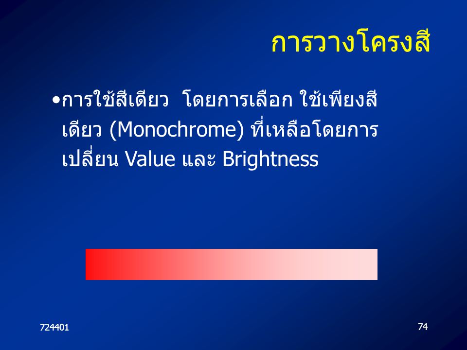
การวางโครงสี การใช้สีเดียว โดยการเลือก ใช้เพียงสีเดียว (Monochrome) ที่เหลือโดยการเปลี่ยน Value และ Brightness 724401
75
การวางโครงสี การใช้สีข้างเคียง (Analogues) โดยการหยิบสีที่อยู่ข้างเคียงกันในวงจรสี สี 724401
 โดยการหยิบสีที่อยู่ข้างเคียงกันในวงจรสี สี")
76
การวางโครงสี การใช้สีคู่ตรงข้าม Complementary Colour
ช่วยกันเกิดการกระตุ้นสะดุดตาได้ดี กระตุ้นการรับรู้ ขัดแย้งได้ดี ควรมีการเลือกใช้ปริมาณสี 70:30 เพื่อให้มีสีใดสีหนึ่งเด่นสะดุดตา 724401

77
การวางโครงสี การใช้สี 4 สีในวงจรสี ในรูป สี่เหลี่ยมด้านเท่า หรือจตุรัส
และแบบ สี่เหลี่ยมผื่นผ้า 724401

78
การจัดองค์ประกอบภาพ มีหลักในการจัดองค์ประกอบใหญ่ 2 ประการคือ
การสร้างเอกภาพ (Unity) การสร้างจุดเด่น เน้นจุดสำคัญ (Emphasize) 724401
 การสร้างจุดเด่น เน้นจุดสำคัญ (Emphasize)")
79
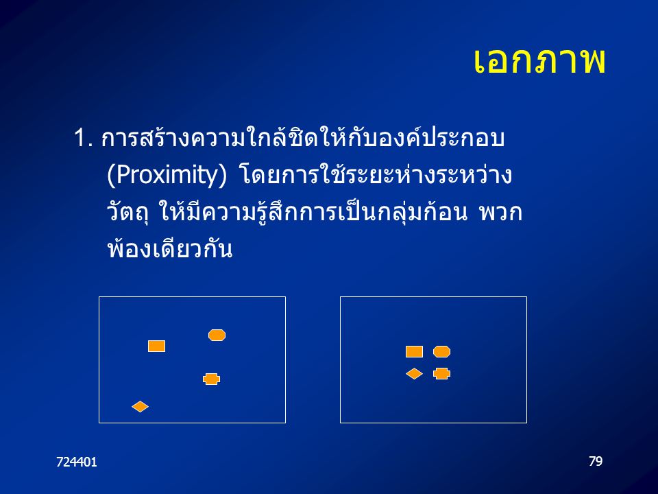
เอกภาพ 1. การสร้างความใกล้ชิดให้กับองค์ประกอบ (Proximity) โดยการใช้ระยะห่างระหว่าง วัตถุ ให้มีความรู้สึกการเป็นกลุ่มก้อน พวกพ้องเดียวกัน 724401
80
เอกภาพ 2. การสร้างความซ้ำกันขององค์ประกอบภาพ (Repetition) 724401
")
81
เอกภาพ 3. การสร้างความต่อเนื่องขององค์ประกอบ (Continuation)
ความต่อเนื่องที่มาจาก เส้น ทิศทางขององค์ประกอบที่อยู่ในภาพ ซึ่งนำสายตาไปในทางที่ผู้ออกแบบนำไป ให้เป็นเอกภาพ 724401

82
เสริมจุดเด่น เน้นจุดสำคัญ
หลักในการสร้างสุดสนใจมี 3 วิธีคือ การวางตำแหน่งจุดสนใจในงาน (Focus Point) การสร้างความแตกต่างในงาน (Contrast) การวางแยกองค์ประกอบให้โดดเด่น (Isolation) 724401
 การสร้างความแตกต่างในงาน (Contrast) การวางแยกองค์ประกอบให้โดดเด่น (Isolation)")
83
Focus Point ต้องทราบว่า ในหน้าจอนั้น ๆ เน้นอะไร ตามลำดับ
มองงานเป็นตาราง 9 ช่อง 0-4 แสดงลำดับความสำคัญของพฤติกรรมของคนส่วนใหญ่ 4 1 2 3 724401

84
Focus Point ตำแหน่งหมายเลข 0
เป็นตำแหน่งที่มีควรวางองค์ประกอบที่ไม่ต้องการเน้น เพราะเป็นตำแหน่งที่สายตาคนส่วนใหญ่ไม่ให้ความสำคัญ 4 1 2 3 724401

85
Focus Point ตำแหน่งหมายเลข 1
มนุษย์ส่วนใหญ่อ่านหนังสือจากมุมบนซ้ายลงขวาล่าง จึงเป็นจุดอันดับแรกในภาพ 4 1 2 3 724401

86
Focus Point ตำแหน่งหมายเลข 2
เป็นตำแหน่งที่มีพลังในการดึงดูดสายตา มีความเฉียบ เนื่องจากเรียกร้องความสนใจได้ดี 4 1 2 3 724401

87
Focus Point ตำแหน่งหมายเลข 3
เป็นตำแหน่งที่สำคัญที่สืบเนื่องมาจากตำแหน่งที่ 1 เพราะเป็นแหน่งสุดท้ายที่คนส่วนใหญ่กวาดสายตามอง 4 1 2 3 724401

88
Focus Point ตำแหน่งหมายเลข 4
เป็นตำแหน่งที่สำคัญที่คนส่วนใหญ่มองก่อนกำหนดอื่น ๆ และเป็นจุดรวมสายตาจากจุดอื่น ๆ 4 1 2 3 724401

89
Contrast การสร้างความน่าสนใจให้กับภาพด้วยการเพิ่มความแตกต่างสามารถใช้ได้หลายวิธี การสร้างขนาดที่แตกต่างขององค์ประกอบ รุปร่างที่แตกต่างกันขององค์ประกอบ รุปลักษณ์หรือลักษณ์ที่แตกต่างกัน 724401

90
Isolation การวางแยกองค์ประกอบให้โดดเด่น โดยใช้หลัก
ขนาดและสัดส่วนในการจัดองค์ประกอบ ที่ว่างในเพื่อที่แสดงการแบ่งแยก ความสมดุลในงาน สมดุล 2 ข้างเหมือนกัน สมดุล 2 ข้างไม่เหมือนกัน จังหวะของภาพ เทคนิคในการออกแบบ 724401

งานนำเสนอที่คล้ายกัน


>")


